Friday, August 27, 2010

UNstudio: loft in new york


UNstudio's design for an existing loft located in greenwich village in manhattan explores the interaction between a gallery and living space. the main walls in the loft flow through the space, and together with articulated ceilings create hybrid conditions in which exhibition areas merge into living areas.


while the walls form a calm and controlled backdrop for the works of art, the ceiling is more
articulated in its expression of this transition. by interchanging luminous and opaque, the ceiling creates a field of ambient and local lighting conditions, forming an organizational element in the exhibition and the living areas. the opaque part of the ceiling consists of subtly arched elements that give a notion of an limitless ceiling which disguises the real height of the space the luminous part of the ceiling is backlit by 18,000 LED lights. this extensive membrane of light serves multiple purposes; it balances the proportions of the loft by creating an illusion of height, functions as unobtrusive space divider, and can be programmed to illuminate the space with various shades of light, from the coolest, most neutral daylight, to warmer tones. by interchanging between luminous and opaque, the ceiling becomes a field of ambient and local lighting conditions.


the third element that the architect has added to this mix is the appreciation of the city which is expressed in the 'framing of the views'. the former windows in the south wall have been replaced by full floor to ceiling glass panes that frame and extend compelling views, over a full glass balcony, toward downtown manhattan.
main walls and ceilings flow through the space, creating hybrid conditions in which exhibition areas merge into living areas; an exhibition wall blends into led illuminated library shelves on one side and a display case on the other. to enable this uniform and seamless space, partly double curved glass fiber reinforced gypsum paneling is used. within these curved wall elements most of the technical installations like hvac and lighting have been integrated.


project info:


cartin loft, new york, usa 2007
client: anonymous
location: greenwich village, manhattan new york, usa
building area: 550 m2
building programme: loft renovation into apartment / private gallery
status: completed 2010

credits:
UNstudio: ben van berkel with arjan dingsté, marianthi tatari and collette parras
executive architect: franke, gottsegen, cox architects, new york.
team: matthew gottsegen, bruce harvey, matt shoor
structural engineer: wayman c. wing consulting engineers, new york
MEP: p.a. collins pe consulting engineers, new york
lighting design: renfro design group, inc., new york
contractor: 3-d laboratory, inc. new york

Wednesday, August 25, 2010

Shade Club / SquareONE

© Courtesy of

Romanian architects SquareONE shared with us the interior design for this club in the basement of a residential building in the center of .

More images and the architects’ description after the break.

Since the 90’s there were many clubs there some of them very successful. Some quiet scandalous. The last years before it was closed, the location was synonymous with some of the Romanian interlope world. So it had a bad name. After a period of almost 5 years the location was rented by two guys who hired us to do an eclectic glamorous club.

© Courtesy of

Since the space is very small, segmented, and with a dark past, and the new owners want at least a elegant, stylish objective, I thought of a mysterious concept with a touch of humor.

A ghostly house animated by the EGO of a small dog. The spectrum is omnipresent.
The furniture is illustrated on the walls 2D imagines. But the shapes are extruded in the space and form continuous volumes trough the club (see the Classic Bar and the Classic Dj booth)

Because the structure was so dense, and the club divided in 3 different spaces, we decided to create different designs and graphic pattern that links the spaces.

© Courtesy of

The lights

It’s a black and white design. I usually use light to color my designs. This is the case here: a RGB spectral tube system that runs on the perimeter. It is mainly indirect light. The same system is used in the first bar too.

The spaces

Funny, when we began the prep there were 7-8 layers of different materials applied on the walls, you could witness the entire history of the location in the past 15 years. That got me thinking about the past.

© Courtesy of

The first space is the biggest and has the highest density of structural pillars. So the first row we covered in mirrors and covered applied 3quarters of a lamp on two edges of each pillar. So we got a sort of tromp de oeil in the first space, so the pillars disappeared and a forest of lamps emerged (the lamps are made of fiber glass skin shaped on massive wood molds finished and polyurethane painted.

The other row incorporates the classic extruded bar and Dj, so in a way they disappear too, being part of the bar design.

The volumetric pattern on the walls is CNC cut dense polyurethane foam white painted. Behinde it we used a mirror for a repetitive visual effect and to relate with the mirror pillars in the space.

The second space is a circular one that runs around the third. To be more precise, the third space is a central lounge box of concrete.

© Courtesy of

Given the shape of the second circular space, we went for an organic design with a baroque decoration; the structural pillars (only one row in this space) were covered in a Corian skin. It is a soft, organic shape vertically extruded. The Corian skin was engraved with the graphic design CNC milled into the surface of the material. Then a special mold was made and the Corian milled plates were thermoformed.

The semicircular bar in the this space was done exactly the same. The walls have a routed MDF structure a Axpet cladding and a graphic design cut and applied on the surface. Axpet is a very thin extremely flexible and hi glossy material (that has a good fire behavior). I tried a lot of material but Axpet was the only to do the job. Otherwise we should thermoform the plates for the walls too. This would skyrocket the costs.

The third space is a small lounge, quite isolated from the rest. The design is basically one lounge sofa, with a helicoidally shape and a ellipsoidal light membrane on the ceiling made of a elastic membrane that diffuses the light. I used white cords hangings to better illustrate the shape and to link the two elements.

The graphic design on the wall is handmade.

The Classic Bar

It is a section through a classic table extruded through the space. There are virtual sections that cut the volume and leave white luminous surfaces with 2D images of different objects (lamps, tables generally house furniture) the ideea was to illustrate a photo of the interior of a house that cuts a volume and leaves a impression.

sketches 02

Since there were so many mirrors it was no need to induce the presence of a former person in the space (regarding the haunting) but working on the design of the bar I felt like putting a character into this scene, or more the suggestion of a big EGO (therorethically it is a good way to underline the social impact of such a public space. The vast mayority of the regular clients have oversized EGO’s ). The Chiwawa light spectrum is a irony to that.

To give a good contrast to the design we used Corian Noir in combination with Glaciar Ice Corian that is translucent. So I used spectral tubes as light source to light up the white surfaces.

"

Tuesday, August 17, 2010

The Prayer Chapel / debartolo architects

By Nico Saieh — Filed under: Religious Architecture , Selected , , , , ,
Architects: debartolo architects ltd.
Location: Phoenix, Arizona,
Project team: Jack DeBartolo Jr FAIA, Jack DeBartolo 3 AIA, J. Eric Huffman, Aaron Taylor, Tim Smith, Kent McClure
Civil + Landscape: wrg design
Structural Engineer: rudow + berry
Mechanical engineer: kunka engineering
Electrical Engineer: associated engineering
Contractor: arthur porter construction
Landscape Design: michael boucher landscape architect
Lighting Design: roger smith lighting design
Constructed Area: 578 sqm
Design year: 2003-2006
Construction year: 2007
Photographs: Bill Timmerman

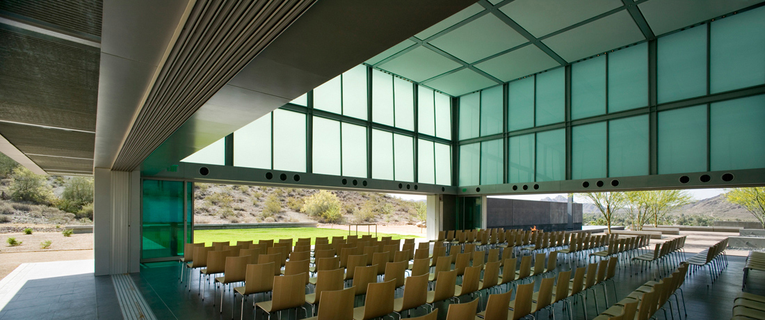
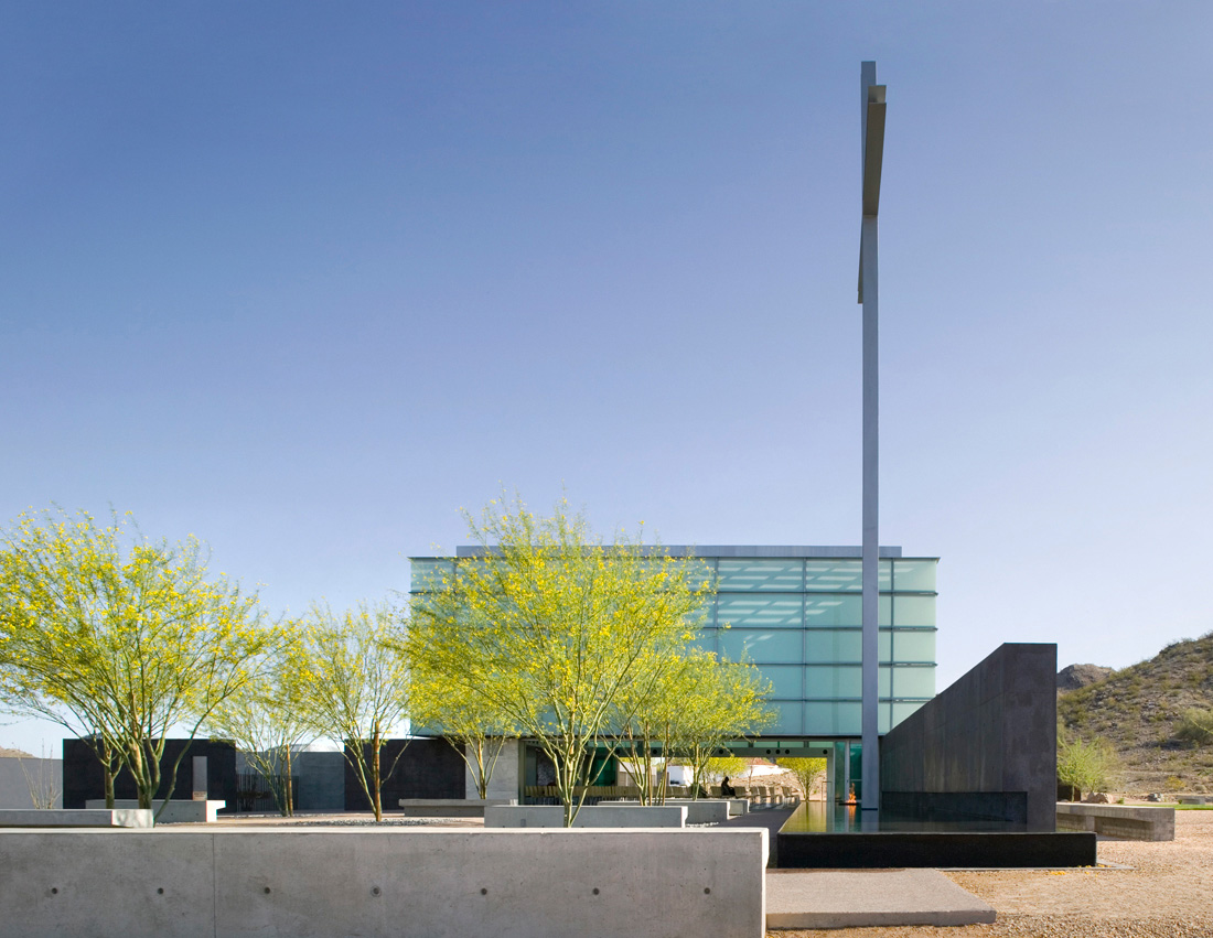
The PRAYER PAVILION OF LIGHT is part of a 58-acre church campus in Phoenix, Arizona, . Sited along the edge of a desert preserve, a series of inclined, landscaped planes are incised by a 600 foot-long processional walk, progressively revealing the orthogonal chapel as one gradually ascends the 28 vertical feet between the chapel mount and garden entrance.
A deep set channel, the narrow garden walk engages the botanical planes in provocative ways; looming, rusted walls gradually diminish to waist height, shielding the chapel while still offering views of the mountain ranges beyond.

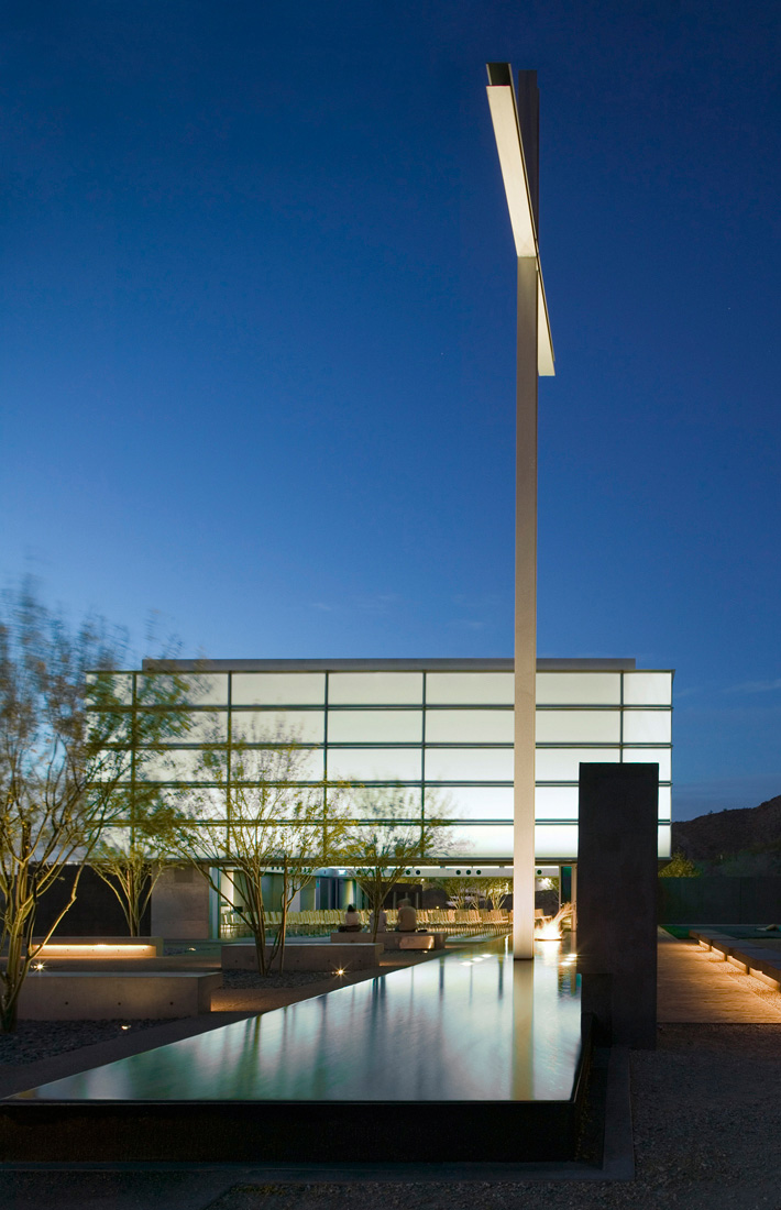
Upon arrival the exposed-aggregate plaza is met by an orderly, yet inviting bosque of desert trees, offering an instant canopy of shade and an elevated vista of the horizon. Bordering the eastern edge of the plaza is a 70 foot-long black reflection pool. Emerging from the mirror-like surface of the water, a flame burns adjacent a 50 foot-high cross. Lit from below the water, the slender cross is visible for miles.
Envisioned as a ‘lantern on a hill,’ the minimal square chapel sits suspended eight feet above the ground, defined by four Vierendeel frames supported on a pinwheel of four black- monolithic walls. Each wall anchors a corner of the ‘glass box’ chapel. The remaining length of wall extending into the landscape captures and defines three unique courtyards around the building.

Sperone Westwater Gallery / Foster + Partners


© Foster + Partners

We took a few shots of Foster + Partners’ latest addition to the Bowery – a new gallery to house the Sperone Westwater’s growing collection from prominent artists of different nationalities and ages. Sitting a few steps away from SANAA’s musuem, this new gallery’s CNC milled glass facade elegantly responds to its neighboring art museum. According to Foster, the gallery is “both a response to the dynamic urban character of ’s Bowery and a desire to rethink the way in which the public engages with art in the setting of a gallery.”

© ArchDaily

The nine-story museum will include flexible exhibition spaces and a dynamic moving gallery. This 12-20 foot moving room is an “innovative approach to vertical movement within a gallery building” as it connects the five floors where the works of art will be displayed, allowing visitors to gradually move between levels. Visible from the street, the platform can also be locked on one floor to extend its space for exhibitions. The architects’ note the contrast between the slow pace of the platform with the fast-paced traffic of the street.

© ArchDaily

The museum also includes a sculpture terrace toward the park and a private viewing gallery at the top of the public floors. The top floor houses a library which doubles as an event space for different functions.

3414713034_1f2e196058_o © Foster + Partners Mobile Photo 16-08-2010 9 48 50 © ArchDaily Mobile Photo 16-08-2010 9 49 26 © ArchDaily Mobile Photo 16-08-2010 9 49 38 © ArchDaily Mobile Photo 16-08-2010 9 50 03 © ArchDaily Mobile Photo 16-08-2010 9 50 36 © ArchDaily

Co-architects: Adamson Associates

Consultants: Buro Happold , Sciame, Buro Happold , Edgett Williams, JAM Consultants Inc.

Wednesday, August 11, 2010

House with Tiny Pool by Shunichiro Ninomiya

House with Tiny Pool by Shunichiro Ninomiya:

House with Tiny Pool by Shunichiro Ninomiy


Japanese architect Shunichiro Ninomiy used an atrium and small pool of water to admit light indirectly to the ground floor of this east-facing home in Osaka, Japan. (more…)


"

High Tide Street by James Gardener

High Tide Street by James Gardener:

High Tide Street by James Gardener


University of Westminster architecture student James Gardener has designed this conceptual bridge for the River Thames, London, made from a series of floating elements that would be linked together and free to move with the tide. (more…)


"

Friday, August 6, 2010

Ecole Professionnelle Viège / Bonnard Woeffray Architectes

Ecole Professionnelle Viège / Bonnard Woeffray Architectes:

© Hannes Henz

Architects: Bonnard Woeffray architectes
Location: Visp, Switzerland
Collaborator: Jean-Pierre Williner
Client: Etat du Valais
Project Area: 4,100 sqm
Project Year: 2007-2009
Photographs: Hannes Henz & BW Architectes

The new class building of the Viège/Visp College of Further Education achieves a transformation in terms of context and enables the linking of the neighbourhood’s schools, the creation of a training campus, and the integration of the future workshops and gyms.

Associated with the new building, the former school playground becomes the benchmark public space of the campus.

The new building’s composition of volumes takes its cue from that of schools in the area, a dissected density facilitating its progression from a two-level volume to one of five levels.

© Hannes Henz

The typology references that of the 1960s building with its central distribution hall, yet radicalises it into a plan featuring three strata, the central layer serving both as distributive and group-work space. The transparency of the lightweight partitions allows this space to benefit from natural light. This typology inevitably exerts an impact on the pedagogical concept.

© Bonnard Woeffray Architectes

The use of materials within the building is confined to the bare load-bearing concrete and to the aluminium combined with the coloured glass of the lightweight partitions, which are finished in various shades of green. The materiality of the exterior confirms the volumetric character – the mirror-finish stainless steel frames of the glazing and the bare aluminium cladding applied to the section cut away from the base quadrilateral. The fragmentation of the reflections created by the bevelling of the facades generates a new context.

Ecole Professionnelle Viège - Bonnard Woeffray Architectes © Hannes Henz Ecole Professionnelle Viège - Bonnard Woeffray Architectes © Hannes Henz Ecole Professionnelle Viège - Bonnard Woeffray Architectes © Hannes Henz Ecole Professionnelle Viège - Bonnard Woeffray Architectes © Hannes Henz Ecole Professionnelle Viège - Bonnard Woeffray Architectes © Hannes Henz Ecole Professionnelle Viège - Bonnard Woeffray Architectes © Hannes Henz Ecole Professionnelle Viège - Bonnard Woeffray Architectes © Hannes Henz Ecole Professionnelle Viège - Bonnard Woeffray Architectes © Hannes Henz Ecole Professionnelle Viège - Bonnard Woeffray Architectes © Hannes Henz Ecole Professionnelle Viège - Bonnard Woeffray Architectes © Hannes Henz Ecole Professionnelle Viège - Bonnard Woeffray Architectes © Hannes Henz Ecole Professionnelle Viège - Bonnard Woeffray Architectes © Hannes Henz Ecole Professionnelle Viège - Bonnard Woeffray Architectes © Hannes Henz Ecole Professionnelle Viège - Bonnard Woeffray Architectes © Hannes Henz Ecole Professionnelle Viège - Bonnard Woeffray Architectes © Bonnard Woeffray Architectes Ecole Professionnelle Viège / Bonnard Woeffray Architectes © Bonnard Woeffray Architectes Ecole Professionnelle Viège / Bonnard Woeffray Architectes © Bonnard Woeffray Architectes Ecole Professionnelle Viège / Bonnard Woeffray Architectes © Bonnard Woeffray Architectes site plan site plan level 00 plan level 00 plan level 02 plan level 02 plan east elevation east elevation north elevation north elevation south elevation south elevation west elevation west elevation section section